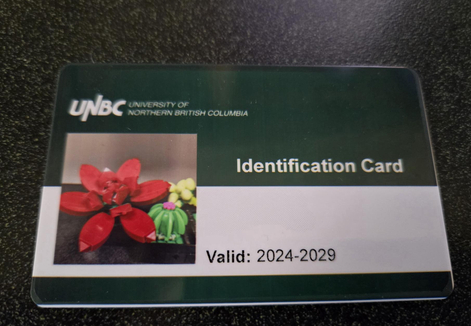
The University of Northern British Columbia may be relatively young by university standards, but its old student ID card design certainly had some tenure. Those red and orange hues had been around for what felt like ages. As someone who’s always been fascinated by experimental design, I was excited when word broke that a revamp was on the way. Would we see something bold? Something edgy? My imagination ran wild. Yet when I finally laid eyes on the new card, I felt torn: on one hand, it’s sleek and minimal; on the other hand, it’s not quite the boundary-pushing design I’d hoped for. But as it turns out, there is a method to this minimalist approach.
To learn more about the design decisions behind the new cards, I reached out to Matt Wood, Director of Communications and Marketing at UNBC. As Matt explains, practical considerations and technical constraints played a major role. “There are a lot of limitations on what can be done with the card,” he says. “Room has to be left for multiple elements, such as long names, photos, and even barcodes in some cases. We had very little space to work with, so adding more decorative elements was not really an option.” Instead of going for eye-catching graphics, the communications team chose the route of simplicity, using UNBC’s official colors and focusing on clarity over flair.
The result is a design that checks all the boxes for functional use: straightforward identification, clear photo display, and space for information that might vary widely from student to student. Matt also notes that this is the first time using a new system, emphasizing that the team approached the design as a test drive. Once the cards see real-world use, there is an openness to revisiting and refining them in the future. From the standpoint of everyday campus life, it is easy to see why a balanced, easy-to-read layout makes sense. It is an ID card, after all, so its primary objective is to confirm who you are and what your status is at the university.
That said, for those of us who adore boundary-pushing visuals, the notion of a more experimental design might still hold some appeal. But in a university setting where identity verification and consistency matter most, the streamlined, classic look might be just right for the time being. It is a clear upgrade: sharp, undeniably UNBC, and built to serve a very practical purpose. Perhaps the future will bring a dash more artistry, but for now, the newly introduced student ID carries the torch of the university’s brand with a clean, no-nonsense approach, just as intended.