Prince George may not seem like a bustling metropolis, but it holds a wealth of opportunities , but it holds a wealth of opportunities and a vibrant community spirit. Within this dynamic landscape, a voice emerged 30 years ago at the University of Northern British Columbia (UNBC) that continues to grow stronger each day—Over the Edge Newspaper.
Let me formally introduce myself: I am Over the Edge Newspaper, but my friends simply call me OTE. I am more than just paper and ink; I am a part of the heartbeat of this community, designed to connect and inform students at UNBC and beyond. Created with a mission to help students adapt to life on campus and in Prince George, I’ve always been a voice for information, a platform for opinions, and a catalyst for change. But who exactly am I? Let me take you on a journey through my history and evolution, starting with how I came to be and how I’ve evolved over the years.
My Birth and Early Purpose
I was created 30 years ago—yes, I’m celebrating my birthday this year! My birthplace is the UNBC campus, where I began as a resource for students, helping them navigate the transition to university life and discover the opportunities available in Prince George. Right from the start, I embraced my role as an information provider, a proud title that defines my purpose. My friends would describe me as observant, energetic, talkative, and kind, always eager to spread awareness, educate, and encourage positive change. Whether on paper or online, I’ve remained committed to giving students a platform to express their opinions and make their voices heard.
Though some might call me old-fashioned for my love of print, I’ve always been adaptable. These days, I’m just as active in the digital world, and if you’ve visited my website, you’ll know I’ve embraced modern technology without losing my original charm.
Logo Evolution
Early Years (18th Century-Inspired Font):

My earliest logo was designed to be bold and eye-catching, with intricate details that mimicked 18th-century fonts. At that time, I wanted to make a grand entrance, capturing attention and portraying myself as an exciting, multifaceted entity.
The Serious Era:

As I matured, I adopted a more classical and serious tone. My logo mirrored this shift, with a refined font representing my new focus on addressing serious issues and providing educational content. This phase of my development was about raising awareness and engaging students in thoughtful discussions.
Going Over the Edge:
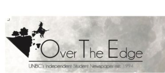
My next major transformation was all about pushing boundaries. My updated logo featured a symbolic icon on the left, representing the act of “going over the edge.” This was a time when I became more active, encouraging my readers to challenge obstacles and embrace change. My tone became more motivational and hopeful, reflecting my growing positivity and inspiration.
The New Me (2024):

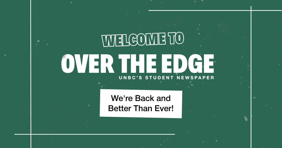
Today, my latest logo is a blend of everything I’ve embodied over the years. It reflects my playful yet serious nature, modern design, and trustworthiness. I’ve become a newspaper that not only informs but also inspires. I continue to address important issues, provide a platform for students to speak up, and contribute to the community in a meaningful way.
